|
|
The Line Model Summary window |
 |
When product models are defined and operations are assigned to workstations, the Line Model Summary window depicted on the left allows you to review the behavior of the line when various models are assembled. This is extremely useful for assessing the suitability of the line for production of a given model mix. The window is accessible via the "Mix Summary" option in the "Variants" menu. There are two tabs in the window. The Model Profiles tab gives a graphical representation of the line, while the Pie Panels tab gives a summary of the main performance indicators in form of a series of highly informative pie charts. |
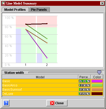
| Model Profiles tab The lower part of the window shows a table of all currently defined models with their percentage in the production. The table allows you to select one or several models, which are then shown in the upper part of the window. The upper part of the window (depicted above)
shows execution times on each workstation.
There is one green/red bar for each workstation (two of them in the above
example), the width of the bars can be adjusted with the Station width
slider, the height can be adjusted by moving the horizontal separator
above the slider. Each worsktation bar shows
Each model selected in the table is also represented by a line in the model's color, showing the time, in percentage of the max peak time, necessary to complete that particular model on each of the workstations. Thus in the above example, the model "Basic" will take about 70% of the max peak time to complete on workstation 1, and about 10% of the max peak time to complete on workstation 2. However, the DeLuxe model will take about 81% of the max peak time to complete on workstation 1, and about 82% of the max peak time to complete on workstation 2. Note that on both workstations, the DeLuxe model wil overflow the cycle time, which is at about 75% of the max peak time.
|
|
|
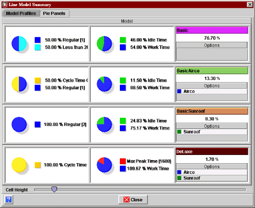
Pie Panels tab The Pie Panels tab, shown in the screen shot on the left, contains a summary of the main performance indicators for each model. There is a three-section box for each of the models. The height of the boxes can be adjusted with the Cell Height slider in the bottom of the window. The right section of a box identifies the model by its name and color, shows its percentage in the whole production, and lists all the options it features (the list may be empty). |
|
The middle section of a box shows the behavior of the model in terms of work time, as compared to the cycle time, summed up over the whole line. The pie chart gives the proportion of
|