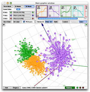
Main Window 3D Mode
|
The purpose of this representation
of the data is to give the user the opportunity to project three
selected attributes of each gene in a 3D space, giving the user
a better appreciation of mutual profile distances than in the 2D
mode. A PCA (Principal
Component Analysis) display is also available.
- To learn more about the button panel (including access to PCA)
click here.
- To learn more about the cube control position drawer click here.
- To learn more about the objects shown in the 3D view click here.
- To learn more about coloring schemes click here.
- To learn more about the window footer click here.
Show all
views available in the Main Window.
|
What exactly is shown in the 3D cube?
The easiest way to understand
the 3D view is to switch off the PCA
axes. In this view, each of the axes of the cube corresponds to one
of your samples, and the interpretation is easy: any profile that is high
(up-regulated) at the time point corresponding to an axis, is represented
by a point that is high (far from the cube's origin) along that axis.
You can select which axis represents which sample with the three selectors
just below the zoom slider.
While the interpretation of the image in the non-PCA
axes is straightforward, those axes do have a drawback: there is often
a steep loss of information in displaying the data. That is because the
cube can only show information contained in three samples, while there
are often many more than that. As a result, many details regarding the
mutual relationships (e.g. distances etc.) among the profiles are lost
in that view.
That is where the PCA
comes in: in order to show as much information as possible, the PCA axes
"condense" the information in your data, so that most of that
information is contained in the three dimensions available to the 3D cube.
This is achieved by "rotating" the data in the appropriate way
(see the explanation of PCA).
Why do the points in the 3D view seem to form a sphere?
You are probably using the Pearson
Coefficient or the standard
correlation to cluster your data, and viewing them in the PCA axes.
Since both Pearson and correlation project all data onto the unit sphere,
it is obvious that one of the most salient features of the transformed
data is that all points are indeed on a sphere. Of course, that
sphere has as many dimensions as there are samples, but in the PCA axes
you typically see most the information. Accordingly, you also see
that your points are projected onto a sphere under Pearson or correlation.
|