|
|
The ClassMarker Result Tab Heat Mode |
| You access this mode by clicking on the “Heat” button of a result tab. |
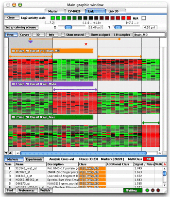 A result displayed as a heat map |
In the left figure there are four classes and twenty markers per class. Each class has its own color. The horizontal arrow shows the marked class. There could be more than one arrow if you use the “Multiclass” option of the classmaker. If you check the “Show
Unused” check box the classes marked unused in the Master
Tab when the analysis was done, will be also drawn on screen. |
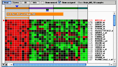 A group in heat mode |
If you check the “Show Assigned” check box the red crosses drawn for cross validation failures will be replaced by a rectangle colored with the assigned class as show in the left figure. If the chosen value for the y zoom value is big enough, the name of the gene and a value will appear on the right side of each row of the heat representation. The value represents the confidence of the marker. An higher value means a better discriminating power. |
Learn more on the heat map representation when the multiclass option is checked here. |